FLY UX
Improving the experience of booking a flight
Improving the experience of booking a flight
The Fly UX project I completed for my UX Diploma at Glasgow Caledonian University, through UX Design Institute. This was an in depth project involving – Research, Analysis, Design, Testing, Protototyping and Wireframing. The project took just under six months to complete and was ready for handover.
Design an improved flight booking experience for the fictional startup airline FlyUX.
The focus is specifically on the flight booking process. How users search on the desktop for flights, find, book and pay for them.
The endpoint for this work is to have designed and build a prototype and created a detailed set of accompanying wireframes improving the experience of booking a flight
I started the process to better understand the user experience when booking a flight by competitive bench marking three the top airline websites and an Air B&B booking app. I then conducted usability tests.
I kept the research open to both platforms, (Mobile or Web). My objective was to discover when booking a flight:
I gathered information about the competition in order to define the basic features of my application.
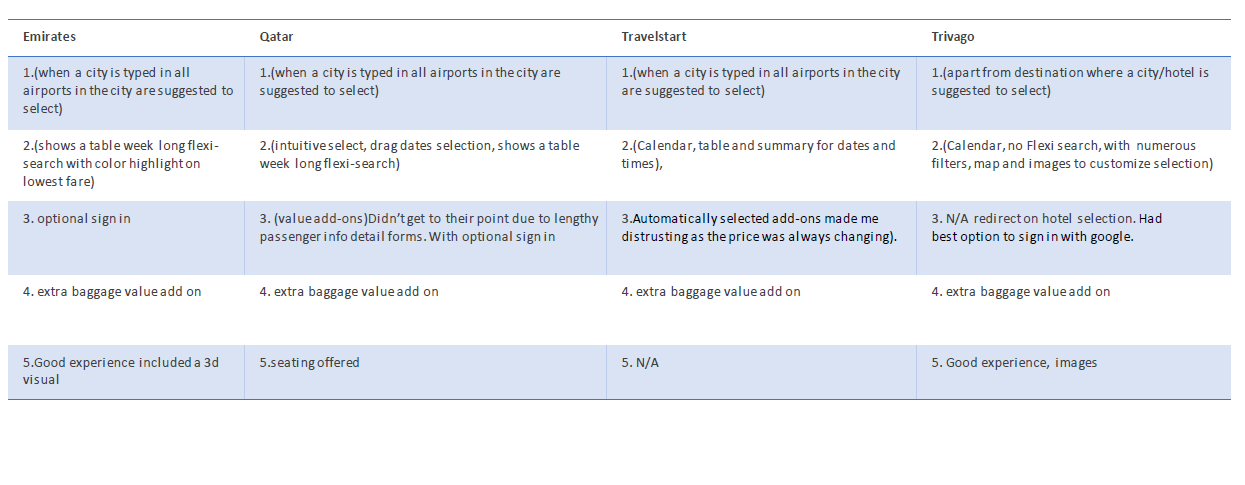
Here are the common best practices among these 3 airlines and travel website:
1. Localized suggestions:
All the airlines/Online travel agency/Hotel booking interface offer a convenient localization on the first text box entry or departure point: this includes language detection, local/nearest point of departure and automated location.
2. Dates & Flexi search:
All the airlines/Online travel agency/Hotel booking interface offer dates calendar drop down and flexi search and then best practice is a table of results with filters to customize the choice.
4. Value Add on’s:
The value adds on which made a difference were the sign in and baggage options.
5. Airline seating’s:
Seating clearly shows legroom, prices and zoning. Hotel booking website ratings, reviews, cost, distance and sort by’s.
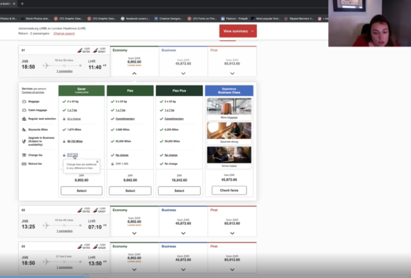
I created an affinity diagram that would help me identify mental models, patterns and pain points that emerged from my research.
Some findings:
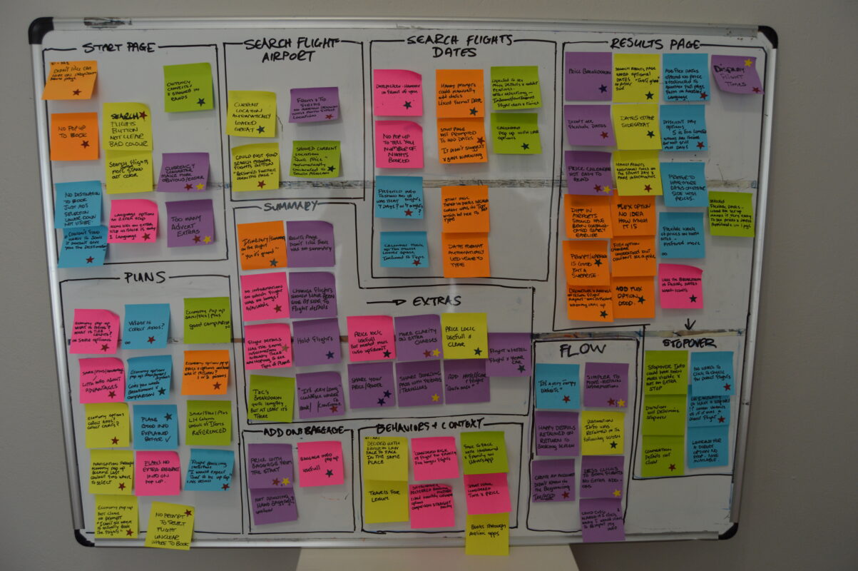
I took the information from the affinity diagram and organised it into a step-by-step view of the journey to show how the users felt at each stage. I also noted their goals, behaviour, context and pain points at each step.

I re-capped how could I translate the user needs into a desktop solution that users would want to use:
I created a user flow diagram to map every step of the user interaction required to achieve the main goal of this app: “As a user, I want to book and pay for a for a flight through the desktop site”
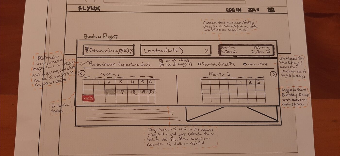
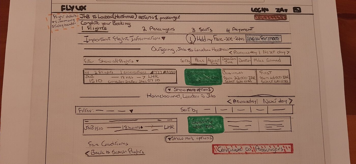
Based on the user flow diagrams – and bearing the main pain points in mind – sketches of the desktop layouts were developed. These sketches included consideration of the primary user flow, positioning of the main navigation and how interactions would work.